Hello👋 Web-enthusiasts👨💻!!
In this blog let's head on to the next very important models which help to make the website flexible...
🖇️Flexbox: The Layout Module That Changed the Way We Design Websites
Flexbox, also known as the Flexible Box Layout module, is a layout module in CSS that provides a more efficient way to lay out, align, and distribute space among items in a container, even when their size is unknown or dynamic. It is one of the most powerful and versatile layout modules in CSS, and it has become an essential tool for web developers.
It is a one-dimensional layout module, which means that it can be used to lay out items in either a row or a column. It is based on the concept of a "flex container", which is a parent element that contains one or more "flex items". The flex container controls how the flex items are laid out, and it provides several properties that can be used to control the size, alignment, and spacing of the items.
📦How to Use Flexbox❓
To use Flexbox, you first need to create a Flex container. You can do this by setting the display property of an element to flex. Once you have created a flex container, you can add flex items to it by setting the display property of the child elements to flex.

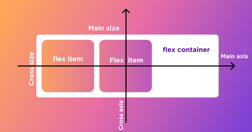
When elements are laid out as flex items, they are laid out along two axes:

The main axis is the axis running in the direction the flex items are laid out in (for example, as a row across the page, or a column down the page.) The start and end of this axis are called the main start and main end.
The cross axis is the axis running perpendicular to the direction the flex items are laid out in. The start and end of this axis are called the cross start and cross end.
The parent element that has
display: flexset on it (the<section>in our example) is called the flex container.The items laid out as flexible boxes inside the flex container are called flex items (the
<article>elements in our example).
Once you have added flex items to your flex container, you can control their size, alignment, and spacing using the following properties:
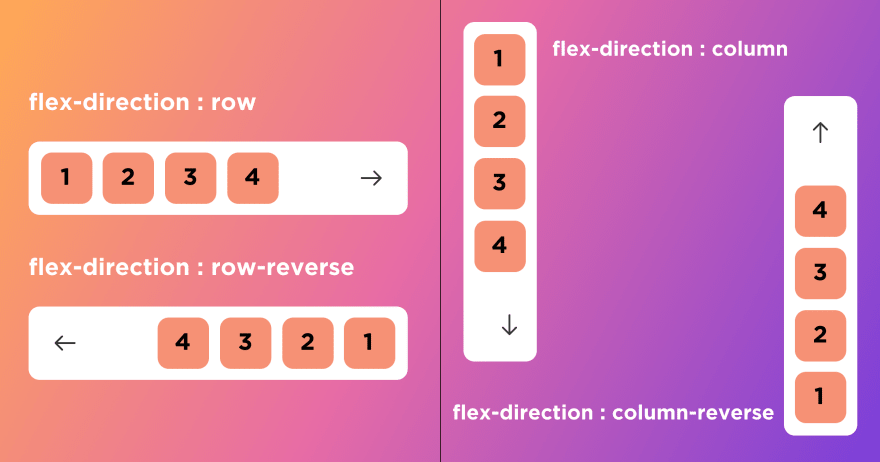
flex-direction: Specifies the direction of the flex items (row or column)

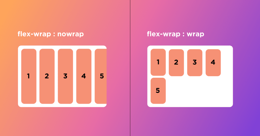
Flex-wrap property is used for wrapping flex-items inside the flex-container.
flex-wrap : nowrapwill not wrap flex-item in flex-container.flex-wrap : wrapwill wrap flex-item in flex-container if it not fit in container size.
justify-content: Specifies how flex items are justified within the flex container
align-items: Specifies how flex items are aligned within the flex container
align-self: Specifies the alignment of an individual flex item
flex-grow: Specifies how much a flex item should grow to fill available space
flex-shrink: Specifies how much a flex item should shrink to avoid overflowing the flex container
Similarly, there are many such properties that1 will help you deal with flex-box in many different ways.
You can refer ➡️https://www.w3schools.com/css/css3_flexbox.asp
📌Flexbox helped developers start to create more responsive and maintainable web applications, but the main idea of a one-dimensional layout system doesn't make sense when you need to build a more complex layout design. This brings us to our next model.⬇️⬇️
🖇️GRID LAYOUT: This is a two-dimensional layout system for the website. It lets you organize content into rows and columns and offers many features to simplify the creation of complex layouts.
➡️So how does Grid architecture work?
📌The Grid items [Contents] are distributed along the main axis and cross axis. Using various Grid properties, you can manipulate the items to create your website layouts.
📌The eight (8) types of grid container properties are:
grid-template-columnsgrid-template-rowsgrid-auto-columnsgrid-auto-rowsjustify-contentjustify-itemsalign-contentalign-items
📌 Let's see a demonstration of some grid properties:
grid-template-rows
grid-template-columns

grid-gap

Justify-content:

align-items:

📩The CSS grid layout module excels at dividing a page into major regions or defining the relationship in terms of size, position, and layer, between parts of a control built from HTML primitives. Like tables, grid layout enables developer to align elements into columns and rows.
➡️For more in-depth knowledge refer the documentation on the following websites:
https://developer.mozilla.org/en-US/docs/Web/CSS/grid
Hope you got some insights on these two layouts!!
All the best!!👍